Overview
CMS publishes provider-level Medicare utilization as open data: every prescriber's Part D drug costs, every physician's Part B services, the full NPPES registry. In 2023 that's $213B of drug cost across 1.10M prescribers and $73B of Part B payment across 1.11M physicians. The question everyone wants answered from it — payer integrity teams, policy researchers, journalists — is the same: which providers' cost and volume sit outside normal variation for their specialty and market?
This build answers it the defensible way: 43.7M rows loaded to Snowflake, an 11-model dbt star schema with the business rules enforced as tests, outlier detection scored within 9,490 specialty-by-state peer groups, and two public surfaces — a live data app and the full model documentation — that anyone can audit without warehouse credentials.
"Outlier" is a statistical descriptor, not an allegation. Defensible patterns — facility-level prescribing aggregated to an attending NPI, sub-specialists in generic taxonomies, oncology panels — produce extreme scores.
That disclaimer isn't boilerplate; it's the design constraint. A flag that can't explain its own denominator is an accusation. Every flag in this mart traces to a named peer group, a peer count, and a stated statistic.
Problem framing
Three observations shape the build, and none of them are about the statistics:
- The load is where honesty starts. CMS embeds suppression sentinels (
*,#) in numeric columns, so typed ingestion silently corrupts the data before any model runs. Every raw column lands as VARCHAR, and staging strips and casts once, visibly. The NPPES file alone is 11.4 GB — DuckDB pre-filters it to 647 MB beforeCOPY INTOso the warehouse only ever sees what the models need. - The peer-group key does more work than the statistic. The first iteration keyed peers on CMS's own specialty text, which lumps 116,056 providers under "Internal Medicine" — and 45% of them flagged. That's not detection; that's a peer group mixing general internists (median Part D cost $97k) with hematologist-oncologists (median $1.1M) and calling the difference anomalous.
- The classical z-score under-flags exactly the tail it should catch. Medicare cost distributions are violently right-skewed, and the mean and standard deviation are dragged toward the extreme prescribers the method is supposed to detect. A robust statistic has to carry the workload.
The data model
The dbt DAG is eleven models in three layers — staging views over the raw VARCHAR tables, intermediate models that compute provider-year aggregates and peer-group statistics, and four marts: dim_provider, fct_part_d_provider_year, fct_part_b_provider_year, and mart_provider_outliers.
The contract is the test suite: 48 tests, of which 45 are schema tests (uniqueness, nulls, accepted ranges, relationships) and 3 are singular business invariants written as SQL — brand-cost share stays inside the unit interval, no peer group below the n ≥ 30 floor survives to the mart, and the overall flag rate stays within reason. Roughly 982 lines of schema YAML document every column. CI runs dbt parse offline against a stub profile on every push — it catches broken refs, sources, and stale schema docs without warehouse credentials living in repo secrets. The honest next step, documented in the repo, is a CI-scoped Snowflake user with key-pair auth so real tests run in CI too.
Methodology — peer groups and robust detection
Peer groups key on NPPES primary_taxonomy_code × state — the registry's hierarchical NUCC code set (865 codes) instead of CMS's coarse specialty text. The switch split Internal Medicine into 28 subspecialties whose median Part D costs range from $5k (Sports Medicine) to $1.1M (Hematology & Oncology) — populations that should never share a baseline — and dropped the IM flag rate from 45% to 31.8%.
An n ≥ 30 floor is enforced in the intermediate layer: with fewer peers, a single high-cost prescriber collapses the MAD toward zero and everyone else in the group looks like a ten-sigma outlier. 9,490 peer groups survive the floor — about 22% of the theoretical taxonomy-by-state grid — covering 7.06M of 7.21M total providers, and the coverage counts are exposed per metric in the mart.
Both statistics ship side by side. The MAD modified z-score (threshold 3.5) is the workhorse — medians resist the mega-prescriber tail — and flags 5.23% of providers (369,200). The classical z-score (threshold 2.0) is the conservative contrast at 2.01% (141,766). The gap between the two numbers is itself informative: it's the size of the tail the classical method can't see.
What the mart surfaces
The findings read like a tour of why peer context matters. Emergency Medicine's median Part D drug cost is $692 — ER physicians prescribe little outpatient pharmacy — but the top provider in that specialty shows $84M against an in-state peer median of $577, a modified z-score of 134,510. That's not a fraud claim; it's almost certainly facility-level prescribing aggregated to one attending NPI — which is exactly the kind of explanation a triage list exists to route a human toward.
The brand-versus-generic analysis is the careful one. Summing every above-median provider's excess brand cost down to their peer median yields $24.4B nationally — and the mart documentation immediately frames that as an upper bound on the search space, not a savings projection. Four assumptions break on contact with clinical practice: not every brand drug has a generic equivalent; dragging the tail to the median moves the median; patients stabilized on brand formulations face real substitution harm in some drug classes; and the data can't distinguish a provider who over-prescribes brand from one whose panel genuinely needs it. What the number is good for is ranking peer groups by gap size, so a formulary committee knows where to start asking questions.
Delivery — two live surfaces
Everything public runs credential-free on GitHub Pages:
- The Evidence data app — five pages (overview KPIs, a metric-parameterized ranked outlier table, provider drill-down, a state choropleth, and the methodology) served static from committed extracts of the mart. BI-as-code: the pages are SQL + markdown in the repo, versioned like everything else.
- The dbt docs site — full lineage graph, every column's documentation, every test.
A five-tab Hex notebook spec (Overview · Outlier Detection · Drill-Down · Geographic · Methodology) with high-fidelity mockups documents the warehouse-native version of the same surfaces — the design for the version that queries Snowflake live rather than committed extracts.
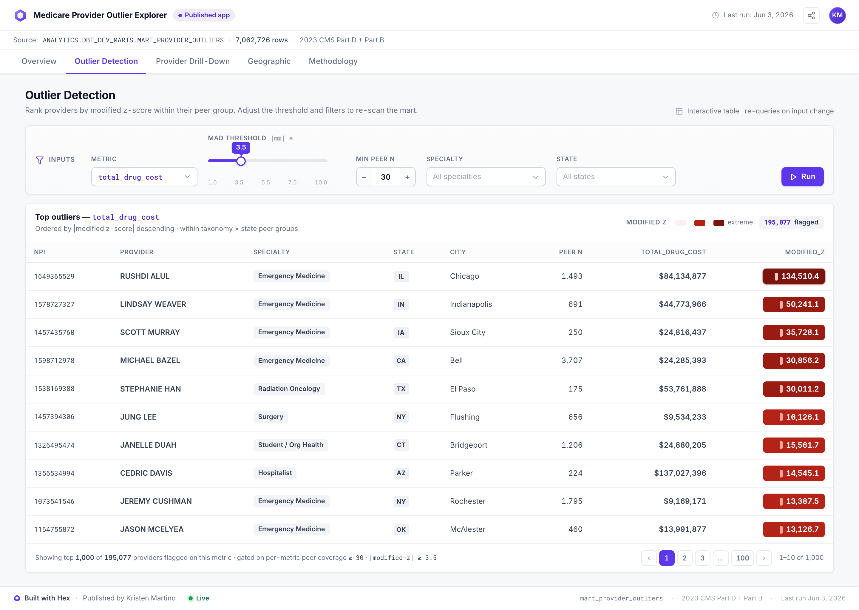
The Hex "Outlier Detection" tab — a high-fidelity mockup of the warehouse-native dashboard spec, not a live notebook. The shipped interactive surface is the Evidence app.
Implementation considerations
Snowflake auth is RSA key-pair, not password. MFA-exempt and CI-portable — the same mechanism a CI-scoped warehouse user would use, so the local setup is already the production pattern.
The Evidence app is static by choice. Committed extracts mean the public surface needs no warehouse, costs nothing to serve, and can't leak credentials — the right trade for a public artifact over open data. The Hex spec is the documented path for the live-query version.
The peer floor is a modeling decision, not a parameter. It's enforced in the intermediate model and inherited downstream, so no consumer of the mart can accidentally benchmark against a thin median.
Reflections
- The taxonomy switch was the project's real finding. The statistics barely changed; the peer key changed everything. Most of the flag-rate improvement came from comparing like with like, not from a cleverer formula.
- Multi-year vintages are the obvious extension. CY 2023 is one snapshot; year-over-year trajectories would separate "consistently extreme" from "newly extreme," which matters for triage priority.
- Geographic granularity is a knob worth exposing. State-level peers are defensible; hospital-referral-region peers would be sharper in large states at the cost of more groups falling below the floor.
- Facility-prescriber separation is the known confounder. The $84M Emergency Medicine outlier is the argument for a facility-billing feature in the next iteration — downweight or segment NPIs whose patterns look organizational rather than individual.
Closing observation
A flag without a denominator is an accusation. A flag with a peer group, a count, and a stated method is a triage list.
The whole build is organized around that distinction — it's why the peer-coverage counts ship in the mart, why the disclaimer leads the README, and why both statistics are exposed instead of one blended score.